Origins
In late 2018, I made a friend through Twitter who's a musician out in Colorado. Her performance name is "Songbabe", given to her many years ago by her son. She'd seen my artwork through a link to this website in my profile, and wanted me to design a logo for her.
Process
Her original thoughts were just this:
"I envision something where the S is a reversed G clef.
Since she's an indie artist, I felt it should be something that had a personalized, hand-drawn look, rather than using a formal font which is more "corporate". And since she wanted the treble-clef for the S, I thought it best to extend the idea to make the entire logo suggest a handwritten music score -- again, to push the idea of an indie artist creating their own songs.
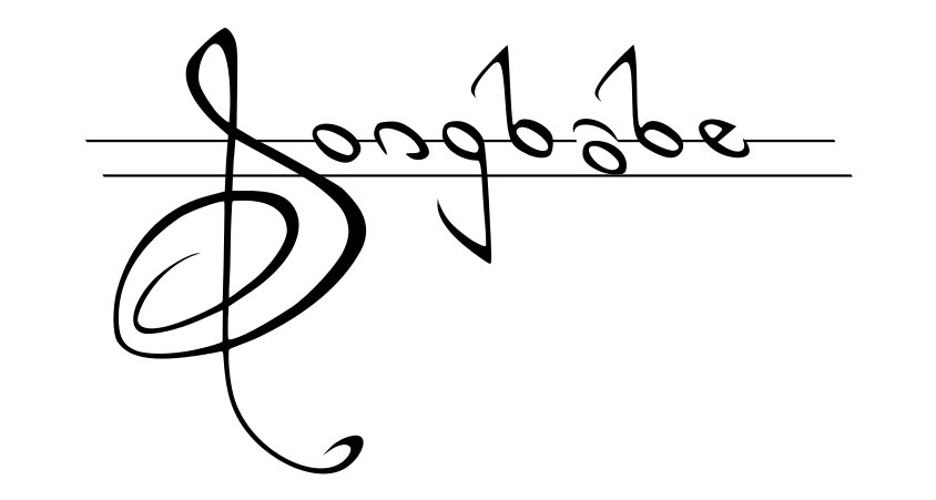
My original take had thin, formal lines, and a minimalist suggestion of a staff meant to suggest the quiet and elegance I'd heard in her music:
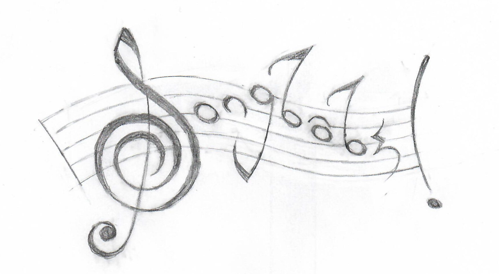
After sitting with it for a day or so, she felt that it was not quite "sparkly" enough. She also asked if the notes could be rising and falling. So I pushed the concept in a much more whimsical, free-form direction, meant to be a little suggestive of improvisational jazz:
I cleaned this up and presented it to her:
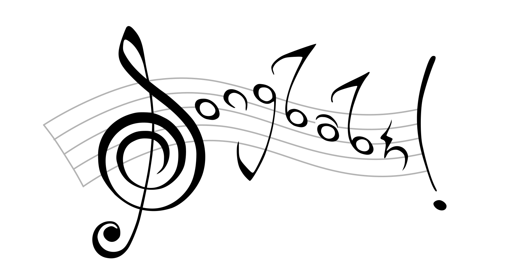
Gradually we calmed this down, bringing it back a little towards the original concept and increasing legibility, while still keeping the fluid feeling:
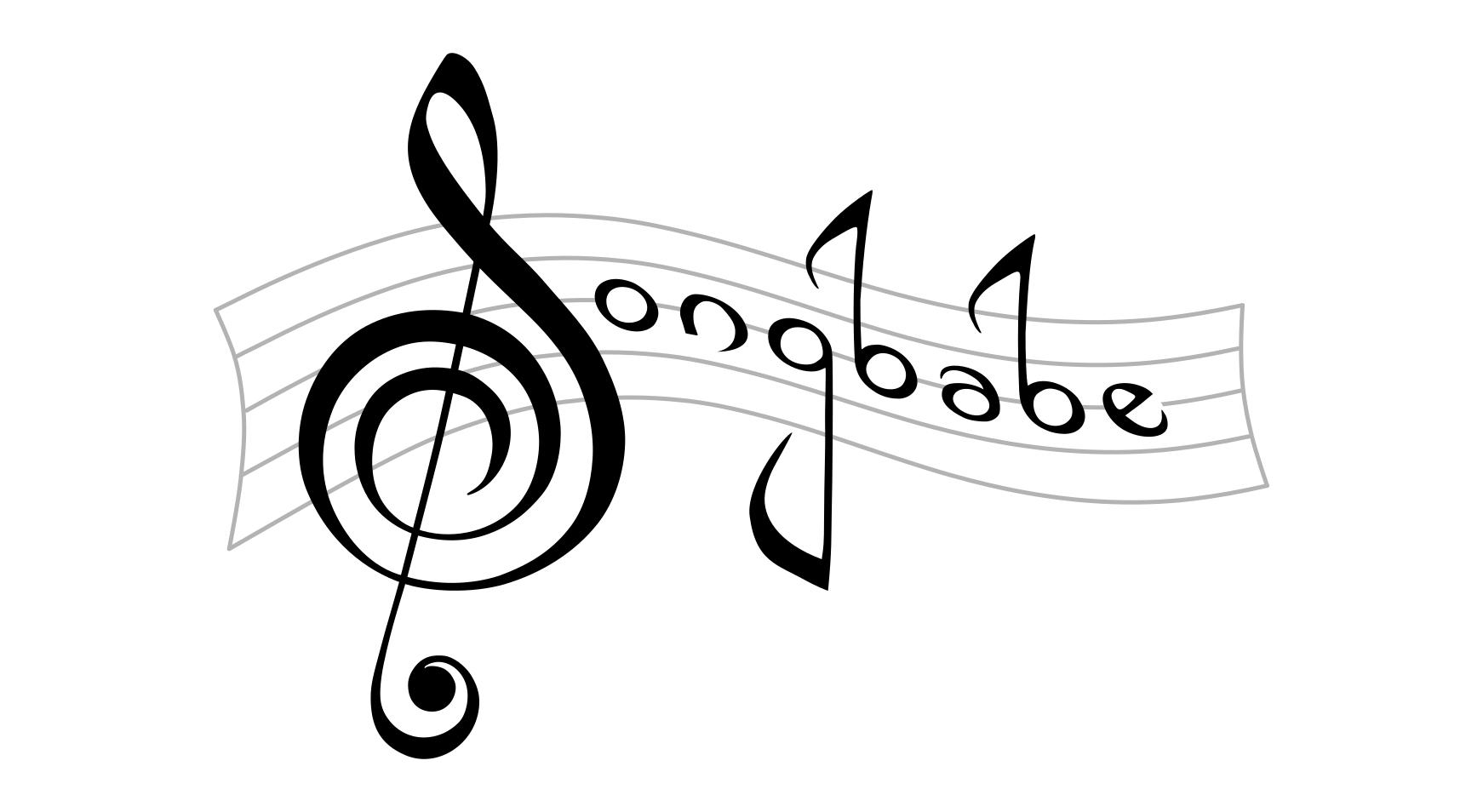
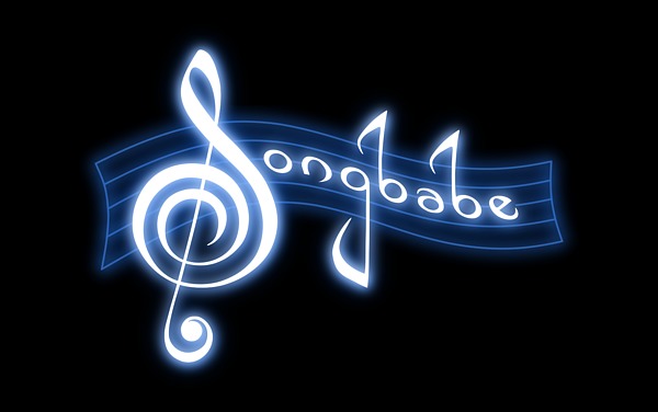
I did a glowing version (the top image) using the celestial colors of blue and white; I'd had a hunch she'd respond well to this palette, and happily she did.
All in all, a very rewarding little project.


