

Origins
Some years I get the idea for a particularly appropriate Mother's Day card, and while I'm working at my tablet all the pieces manage to fall effortlessly into place.
This was not one of those years.
Deborah (my lady) said that one thing she really respects about my artistic process is that I'm willing to throw away designs that simply aren't working, no matter how much time or effort I've put into them. I think that's rooted in my profession. To be a good software engineer, you have to constantly re-assess a system as it evolves and identify parts which need to be either rewritten or scrapped entirely. It's a painful habit to learn. One important step is recognizing that when you continually aim for improvement, there is no such thing as "wasted" time, for all your time is spent sharpening some skill -- even if it's just the skill of recognizing that what you've produced is unsalvageable crap.
Which is how this piece began. I had a vision, struggled with it for days, and finally tossed it aside and started fresh, unburdened by the past, re-energized. In that sense I'm the opposite of my late uncle. He held onto things long after they stopped being useful or giving him joy. If you do that for long enough you end up living in a junkyard.
Inspiration and themes
My mother had a couple of stents implanted very recently, so this year's card was inspired by that event and by my experience of the hospital where she had the procedure. Ideas which flitted through my head as I shaped the piece:
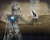
- The mixing of organic and inorganic elements (i.e., cyborgs).
- Iron (blood uses iron to carry oxygen, and stents are made of stainless steel mesh).
- Tubes -- veins and arteries, stents, IV tubing, surgical ports, wires.
- The cold, mechanical, impersonal atmosphere of hospitals. The fragility of the human body.
- The sense of helplessness.
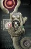
- EKGs, monitors, and the reduction of the human body to graphs and numbers.
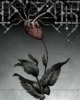
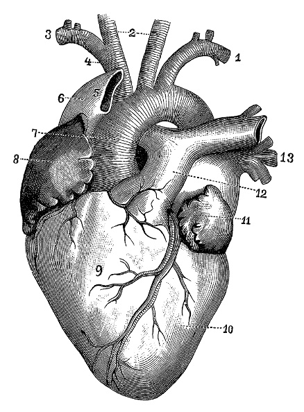
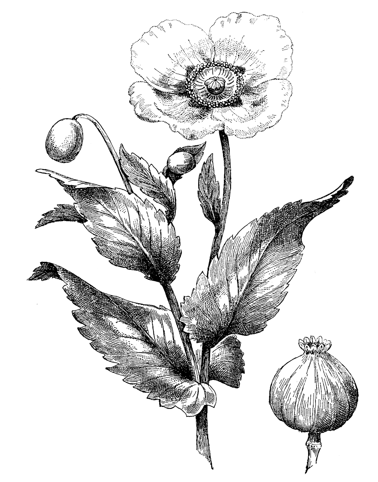
It all started with the mental picture of a rose (fragile, organic, "veined") where the red blossom was replaced by a human heart. I wanted the lower-left of the picture to be the familiar, peaceful, organic world of the living plant, while the upper-right would be the alien, menacing, inorganic world of the hospital. Caught between the two would be the heart. Instead of a body, I imagined that the coronary veins and arteries would be shunted into plumbing with knobs and gauges. This would represent the various mechanisms that patients are plugged into for the purposes of diagnosis, monitoring, life-support, and the operating procedure itself. Ideally, the viewer's eye should move along this lower-left-to-upper-right vector, to take them on the same journey as my mother.
Process
One artist whose work I very much admire is H. R. Giger, who explores similar themes -- albeit with more of a futuristic and "body horror" aspect. But I didn't want to consult his work for fear of drawing too much from it. In the end, I let my memories of his painting suffice. Like Giger I would use a desaturated palette, with strong black elements. But first, I had to decide what colors would be in that palette.
A bold, saturated blood red was the obvious color choice for the focal element of the heart. To balance it, I chose its color opposite: a pale, desaturated teal. Appropriately, this is a common color for medical scrubs, and the reason may not be coincidence:
Green could help physicians see better for two reasons. First, looking at blue or green can refresh a doctor’s vision of red things, including the bloody innards of a patient during surgery. The brain interprets colors relative to each other. If a surgeon stares at something that’s red and pink, he becomes desensitized to it. The red signal in the brain actually fades, which could make it harder to see the nuances of the human body. Looking at something green from time to time can keep someone’s eyes more sensitive to variations in red...
Second, such deep focus on red, red, red can lead to distracting green illusions on white surfaces. These funky green ghosts could appear if a doctor shifts his gaze from reddish body tissue to something white, like a surgical drape or an anesthesiologist’s alabaster outfit. A green illusion of the patient’s red insides may appear on the white background... The distracting image would follow the surgeon’s gaze wherever he looks, similar to the floating spots we see after a camera flash.
Since the final piece would be largely desaturated, I decided to start my work in grayscale. This was relatively easy, since I had already planned to use black-and-white anatomical engravings for the heart and the body of the rose. My plan was to work on lines first, shadows next, and leave color for the very end. By focusing so much on tone, I hoped that the piece would arrive at a good visual balance without the false starts that have plagued many of my other works. I'd like to say that it worked, but I really missed the energy of playing with color from the get-go. Many times I have found sudden inspiration -- and joy -- in the hues of some random visual element I pulled off the web -- the blue sky in "The Fable of the Stork", or a spray of stars in "Luna Creatrix". Working in grayscale was more efficient in the same way a six-lane highway is more efficient than a winding mountain road.
Still, I had already made one false start, and things weren't looking good for meeting my Mother's Day deadline. As I said, I don't mind throwing things away, but being stressed for time made me fear unnecessary trips down the garden path. I began to second-guess myself.... a lot.
Deborah's help was invaluable during this time. Often I would introduce a visual element that felt right only to have the nagging sense that it was throwing the composition off. At these times I would call her in to look at the addition, and she would be able to put the problem into words. For example... I was originally going to put a calyx at the base of the "rose blossom". I found suitable clipart, scaled and edited and colored it, then stepped back and found myself strangely unhappy with the effect. Deborah pointed out that the sepals interrupted the movement of the viewer's eye up the stem to the "blossom" and beyond. I had unwittingly thrown a visual barrier right in the viewer's path, all for the sake of a completely irrelevant botanical accuracy!
Although I made my Sunday morning deadline, I did some additional work on Sunday afternoon to finish the piece to my satisfaction. Mostly that involved:
- fixing the color balance of the heart
- adding backlighting around the edges of the heart
- introducing reflected color to connect the various components (e.g., having the red of the heart echoed in the steel pipes).
- darkening the leaves of the plant
- adding bits of actual medical pamphlets that my mom was given after her procedure.
Finally: look closely at the EKG graph at the bottom of the picture. It's probably not what you think it is. :-)
Ingredients
I used the GIMP for the editing, together with my Wacom digital tablet.
Nearly all of the ingredients were found on the web. Usually I did Google searches on the subject and picked the image(s) I most liked, regardless of where they came from.
- The heart is from the Dover Anatomy clipart collection (#163).
- The stem and petals were found on the Web.
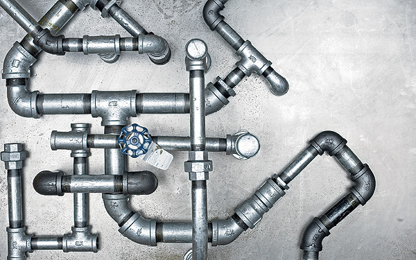
- The pipes were found on the web, then cartoonified in Gimp, separated from their background, edited to fill in gaps, and finally repeated throughout the image at three scales: large (foreground), small and dim (middle-distance), and tiny and dimmer still (subtle texture in the background).