
Inspiration
"Luna Creatrix": my 2011 Mother's Day card.
This past month, my mother took me and my lady to the Hayden Planetary in New York City, a place I probably haven't been to for over thirty years. The first time I went there was around when I was in first or second grade. I had no idea what a planetarium even was,1 but by the end of the day I was thoroughly in love with astronomy -- as I still am today.
Over the years my mother nurtured that love. She got me a telescope, and a star atlas, and countless books on astronomy and astrophysics, and (of course) she brought me to many, many more planetarium shows and space museums over the years.
So this year I wanted to honor the connection between mothers and the heavens.
Symbolism
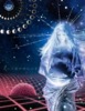
The moon is the closest heavenly body to Earth, and as moons go (in this solar system, at least) it's unusually large compared to the planet it's orbiting. Its gravity is so strong that 1.3 billion cubic kilometers of ocean water bulges under its influence, causing the tides. It circles the earth every 28 days. During this time it always shows the same face to us: we call this phenomenon tidal lock.
The Greek word for moon is mene, from which we get the Latin word menses meaning "month"; and from that we get the word "menstruation". Some believe that the 28-day human menstrual cycle has its origins in the clockwork phases of the moon -- that somehow, long ago, women became "tidal locked" to the moon. I wanted to capture that relationship.
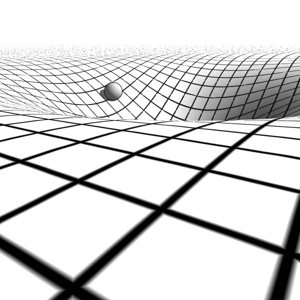
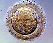
So this year's card shows the moon as the rounded pregnant belly of the Roman goddess Luna. The space-time grid behind Luna represents the moon's gravitational influence, but the red color is meant to suggest inner space, and the gravity well nearby holds not a planet but an unfertilized human ovum.
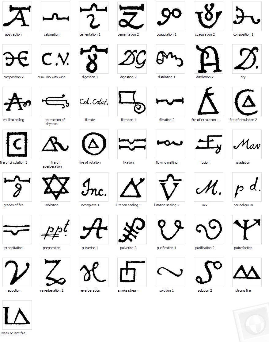
Above the red ovum are alchemical symbols which represent the intricate process of creation. Reading from left to right, the ones shown are: abstraction, calcination, cementation (two variants), coagulation (ditto), composition (ditto), and digestion. It's a happy coincidence that this sequence starts with something that looks like an Alpha and ends with something that looks like a combined Alpha and Omega -- those two letters representing the divine forces of creation and destruction.
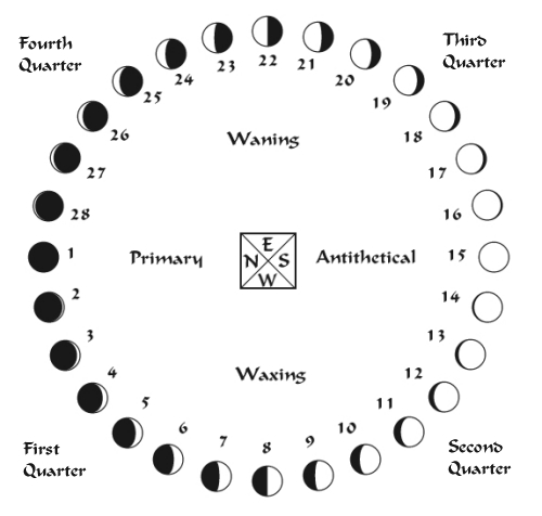
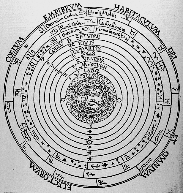
In the upper left, within nested representations of the moon's phases and depictions of the planetary orbits, that same ovum is now fertilized and about to divide in two. Where the grid below emphasizes space, the orbits above are meant to suggest time.
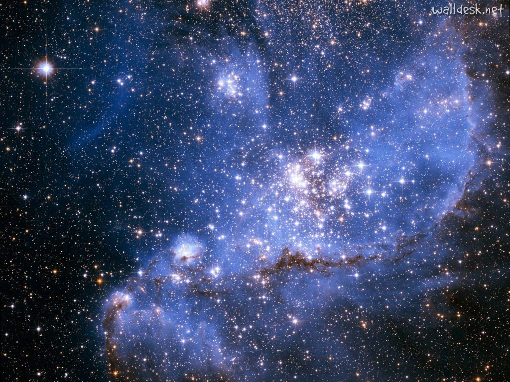
Behind Luna, stretching out to the right of the canvas, is a stellar nursery, a place where new stars and planets are even now being born.
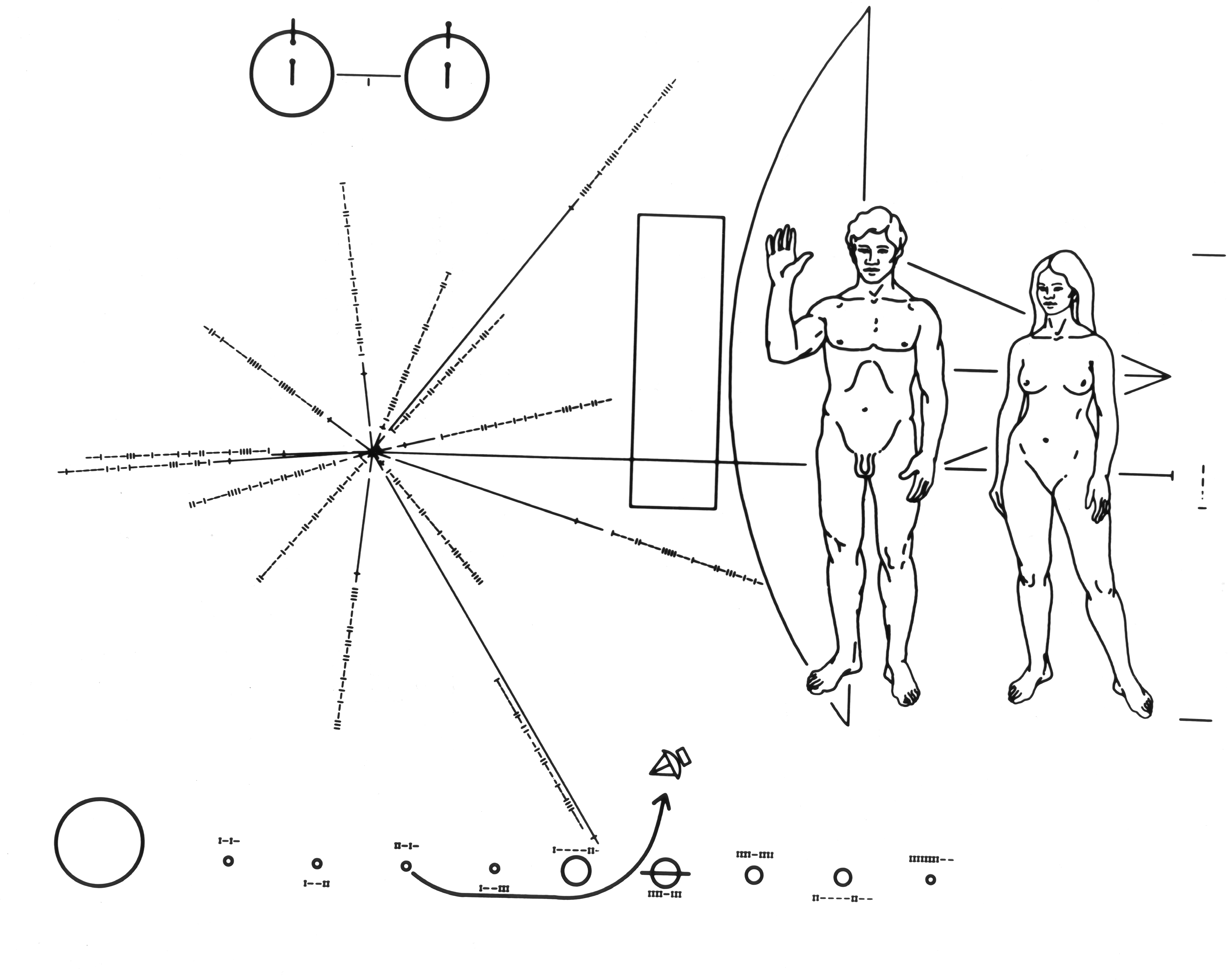
Behind her head is a celestial crown made not of moonbeams but of pulsar coordinates which show her (and our) location in the Universe. This is a portion of the plaque we sent out on the Pioneer 10 space probe, as part of our search for intelligent life in outer space. When the plaque was scaled to this size, its diagram of the solar system fell at Luna's thigh level. The hollow disk on her left thigh is Earth (the location of the moon, of course), and the line leading off to the right is the trajectory of Pioneer 10. Another invisible synchronicity: where the center of the Sun would be on the plaque, there is the center of the red ovum and its gravity well -- approximately the right size and texture for a star.
And as with the Pioneer 10 probe, there is a message of greetings -- if you know where to look.
Components and process
As usual, I used the GIMP for the digital editing, and my Wacom tablet. A small amount of work was done in Inkscape, which is the Linux analogue to Adobe Illustrator. Season 4 of "House, MD" was playing in the background. I always put on "House" when I do anatomically-inspired artwork.
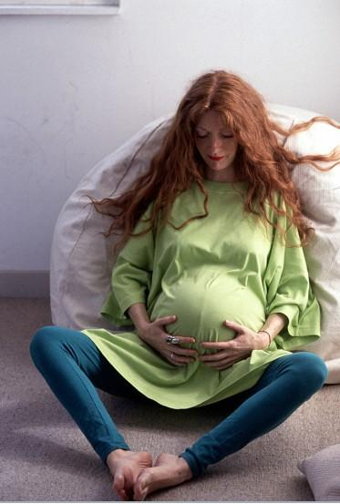
I started with Luna -- her upper half, anyway. She began as a stock photo I found on the web, licensed under Creative Commons (AS0000001F20, "Pregnancy", by Anthea Sieveking, courtesy of Wellcome Images) The woman had exactly the look I wanted: full round belly, good placement of hands, and contemplative expression. To give her an unearthly glow I simply made the digital-negative image and played with the color until everything was in the cool end of the spectrum. Unfortunately the source image was small and the enlargement showed artifacts, so rather than make corrections I went the other way. I slightly blurred the image, autotraced it to 32 hues (kind of like posterizing but you get resizable curves), and then superimposed the photo with the approximation.
Still, her face bothered me. Digital negatives of faces look really, really wrong. We're cognitively wired to read subtle cues in facial contours, based on natural lighting and shadows. So for the final draft I brought her face back in as a color positive, albeit with a cold color scheme and with much of the contrast removed to give her a soft glow.
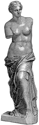
Luna's lower half is actually from a woodcut of the Venus De Milo from a Dover disc of clipart. Yes, it's astoundingly appropriate that I used a statue of Venus in a fertility piece. No, I am not that subtly clever -- the dress just worked very well, at least once I resized it. To subtly unify Luna's upper and lower halves I brought some background color from her upper half to the lower, and added some woodcut-like accents to the upper.
Various other components I got from googling:
- the lunar cycle at upper left
- the Aristotelian cosmos, also at upper left
- the Pioneer plaque for the pulsar coordinates
- the spacetime grid
- the alchemy symbols at middle left
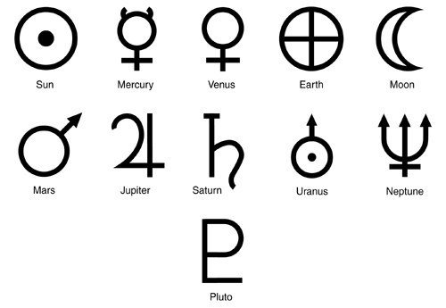
- the moon symbol above Luna's brow
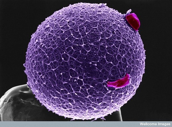
- the unfertilized egg at lower left
- the fertilized egg at upper left
- the stellar nebula to the right of Luna; and
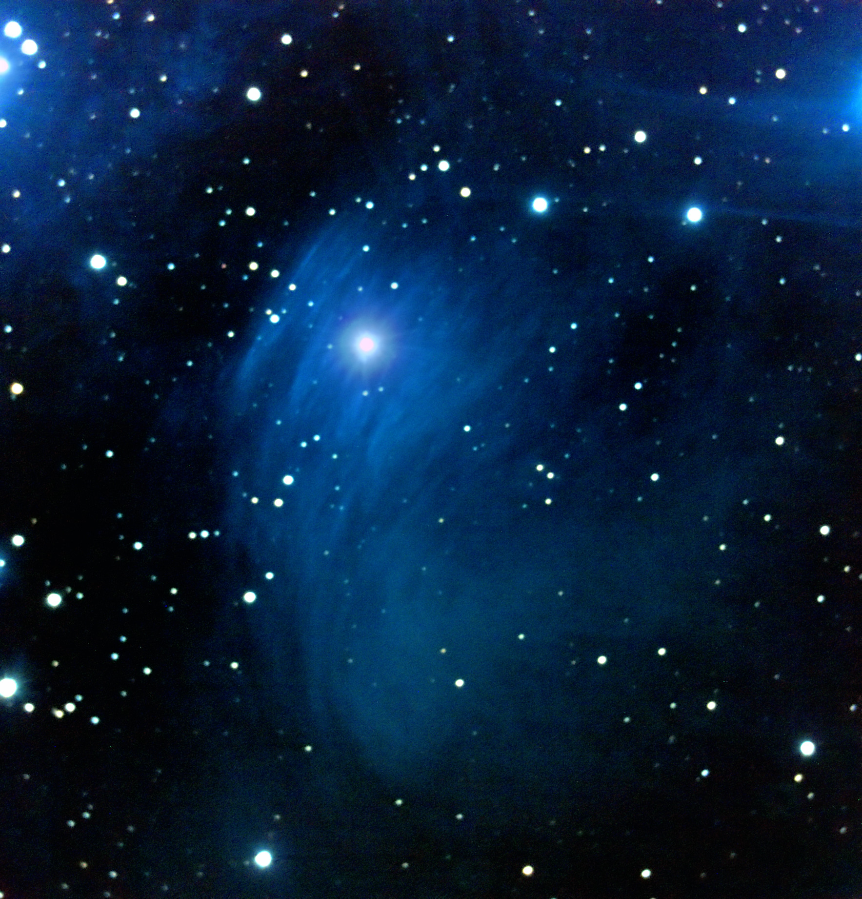
- the other background stars
The colors needed to suggest both the cold moon and the warm human body, so I chose a palette that went from a warm blue (top) through violet (right) and eventually to a cool red (bottom). I played with a few different nebula photos and happily found one I could use without any color correction. The greenish-black of space in the middle-left was a fortunate accident, but both the ova and the grid needed to be seriously colorized to get the effect I wanted.
The transition from face to garment was too harsh, so I overlayed both blue and red versions of her dress as mostly-transparent layers, then faded in those hues to match the ambient light where it made sense.
Finally: God, but her belly put me through hell. I wanted to use an actual moon there, but every time I did it no longer looked like she was pregnant -- instead, she looked like a woman carrying a moon in front of her. For the initial version I added a few more folds of fabric and settled for an echo of the space-time grid. It worked well enough, but looked vaguely like a basketball. For the final version I just got rid of it. Sometimes you just have to let go of your original vision or the final piece suffers for it.
1 I vaguely recall that it was with a class trip, and I remember someone telling me, "We're going to the plantarium tomorrow." It sounded like a cross between plant and terrarium -- I swear I thought we were going to some kind of big greenhouse. I was thoroughly prepared to be bored out of my skull.