


Inspiration
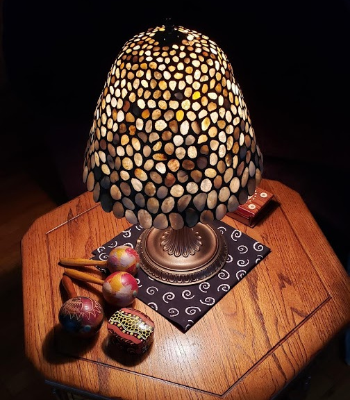
One of the many things my mother taught me was how to work with stained glass. She's made a number of pieces over the years -- small boxes, lampshades, window panels -- including a wonderful shade made entirely from translucent stones we gathered on various beaches during our sandcastling excursions.
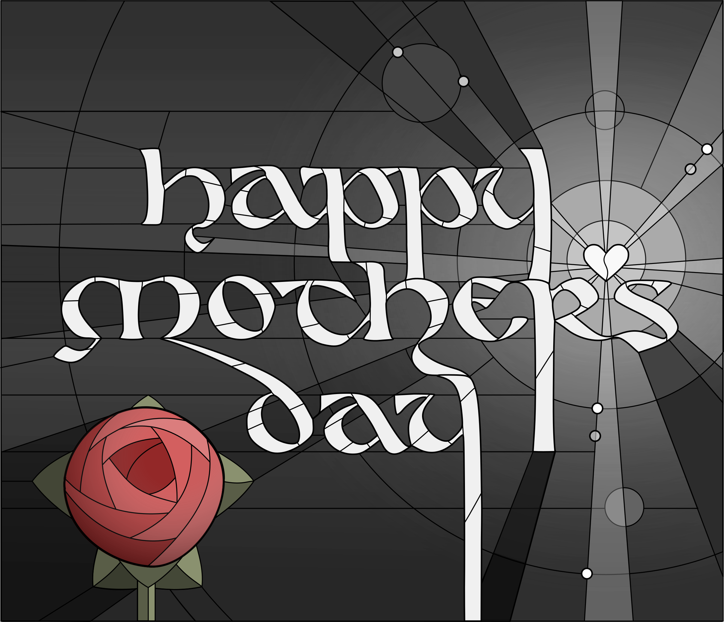
Recently I visited the National Cathedral to light candles for my late uncle, and as usual I lingered afterwards to gaze at the breathtaking windows there, and to soak in the pools of soothing, particolored light that spilled onto the stone walls and marble floors. When the Notre Dame Cathedral burned, I was most relieved to learn that the stained glass windows had survived, particularly the elaborate Rose Windows that I remembered from my visit there. So stained glass has been on my mind quite a bit lately, as has the phrase "rose window".
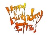
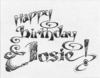
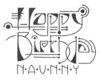
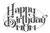
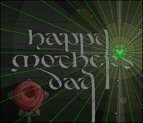
Here, therefore, is my 2019 Mother's Day card -- a stained-glass window made with exactly one sheet of glass: the one sitting right above my computer keyboard. Dedicated to my mom for all the beautiful pieces of artwork that she has made, and has taught me to make -- and appreciate -- in turn.
Process
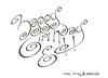
I started with the lettering, choosing a half-uncial style because it felt appealing, and because the varying weight of the calligraphic strokes would give me thick and thin "pieces" to play with in the stained glass design. I created all the letters freehand with pencil and lined paper:
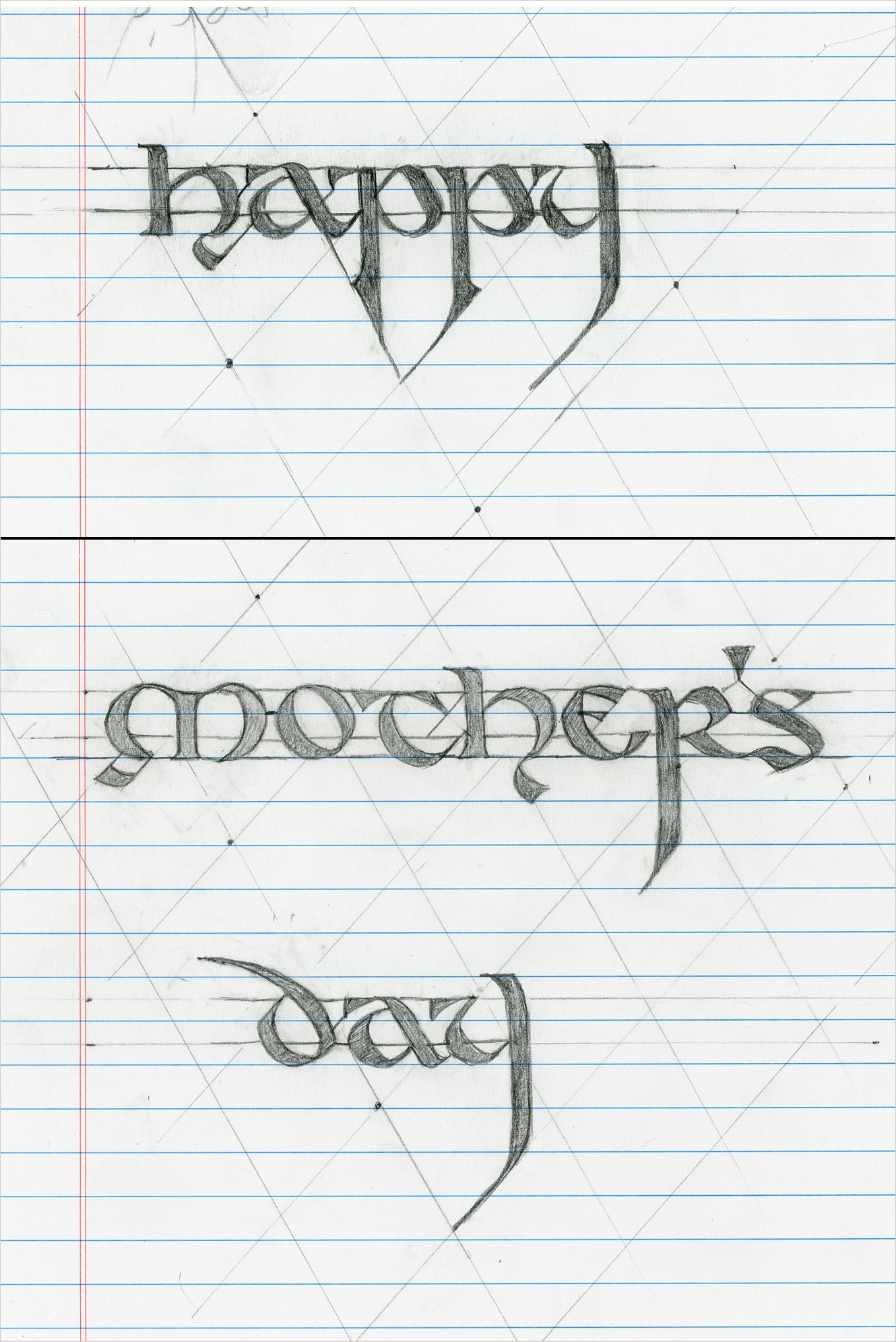
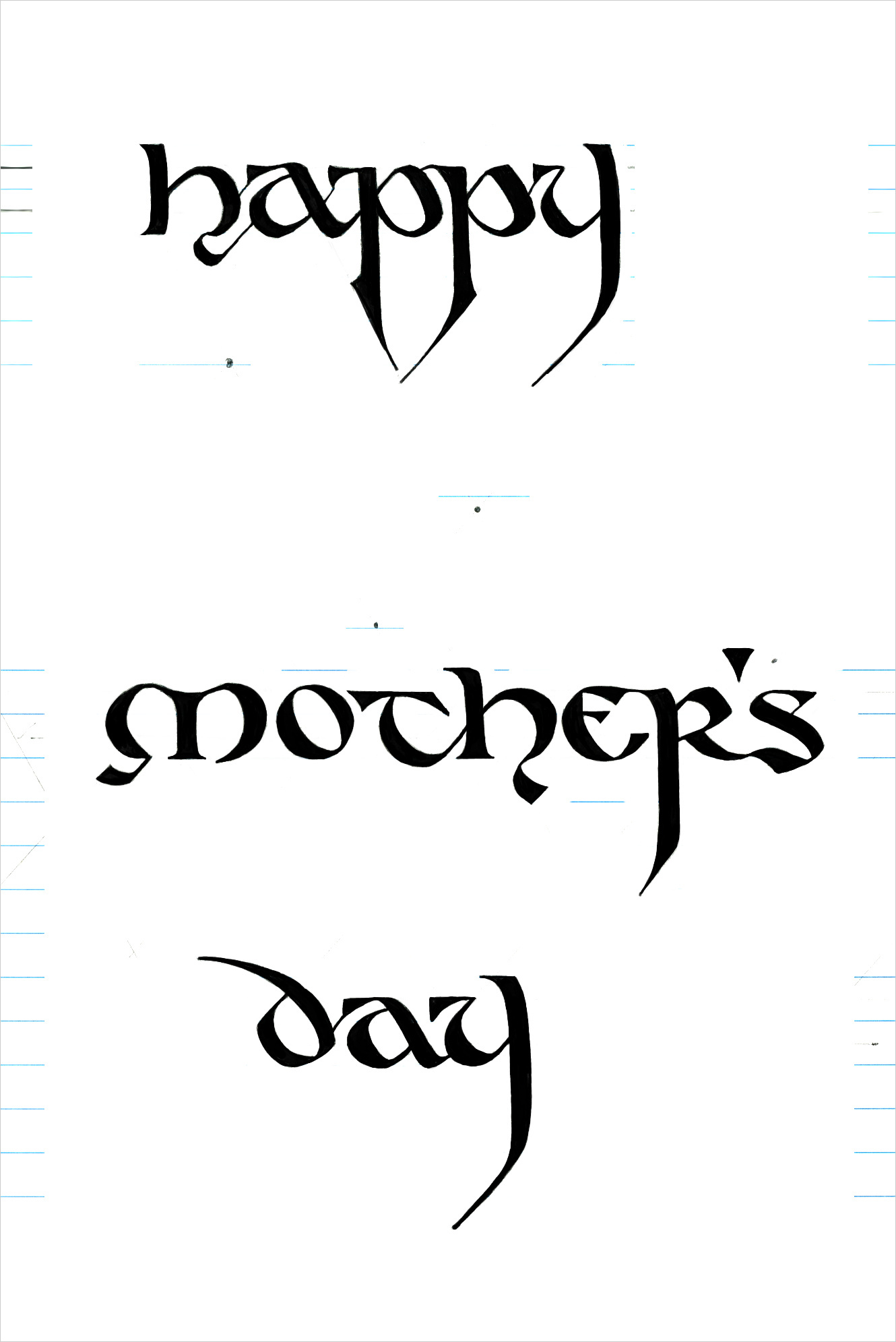
I was pleased with the results, but I didn't know exactly what I'd do with them; how the words would work into an actual composition.
Searching for inspiration, I looked at last year's rather somber card and realized that I wanted to make this year's card into sort of sequel: to take the key element of the rose/heart and recast it from something dark, clinical and menacing to something bright, organic, and full of life. Initially I was just going to build the piece around the rose, but as I worked on the lettering the stylized "valentine" heart evolved from a humble apostrophe into the primary light source and, thus, the visual focus of the piece.
The first unusual aspect of this piece is that I did almost all of it in Inkscape, my favorite vector-graphics drawing program. Normally I work in GIMP, and only use Inkscape for the "digital inking" of scanned pencil art, via its pixel-to-vector engine. But here I only used GIMP at the very end, for texturing, glows, blurs, and other pixel-oriented effects. Given the highly geometric nature of this piece it made sense to work exclusively in vectors -- right up through (and including) the coloring phase.
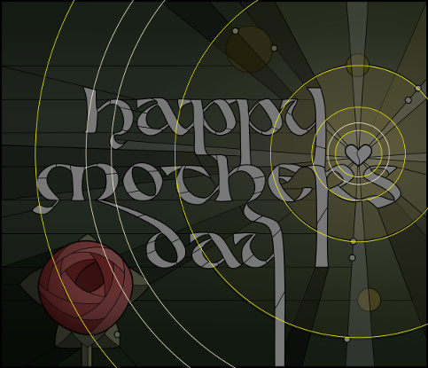
Which leads me to the second unusual aspect of this piece. I started working with just hollow outlines, but quickly found it next to impossible to visualize how the piece was coming along. Not wanting to commit to color at an early phase, I compromised by using grayscale. This technique is called Underpainting. It allows the painter to make sure that the values (light versus dark) work together in the composition before fiddling with hues and small details.
Borrowing another technique from painting, I started with a toned ground as my background layer, using a medium gray which faded to darker gray at the top and bottom. I then filled the (glowing) heart with opaque white, the rays with semi-transparent white, the letters with opaque light gray, and then I proceeded from there, bumping values up or down until they looked pleasing. When I developed the light "rays" coming off the heart, it was obvious that I needed a darker background to make them stand out, and this led me to the idea for having the letters cast "shadows" -- which improved the piece dramatically. Not a single drop of digital pigment hit the canvas until I added the Charles-Renne-Mackintosh-inspired rose:
One nice thing about working with Inkscape is that my fill/line color dialog uses HSV instead of RGB, so when it came time to "colorize" my grayscale all I had to do was change the Hue and Saturation values and leave the Value alone (for example, turning a gray shape into gold meant changing its HSV from [0,0,x] to [37,99,x] for whatever x happened to be). This led to an almost perfectly faithful translation into color with very little fiddling.
I decided to use the same basic color palette as last year to make the "sequel" concept more explicit. So again I started with rose-reds and leaf-greens, but this time I kept them at full saturation. Whereas before the illumination was an antiseptic white fading through cold grays, here it would step through warm and translucent golds.
By the way, do you notice how the transition from white to gold to bluish-green is so seamless? My secret is, ironically, borrowed from actual stained glass (and watercolor) artistry. Instead of blending colors in the palette, I just apply the first color atop the second with varying degrees of translucency. In watercolors this is called "glazing" and is done wet-on-dry; in stained glass it's called "plating", and is done by stacking layers of glass.
Which leads me back to the "stained glass" effect. I applied an actual glass-back texture to the final piece, and used a blurred copy of the lead joints to simulate the grime that invariably collects in the crevices of such windows. And, of course, I added a glow coming right through the clear glass marbles and especially through the heart, which I imagine as a thick chunk of soft, clear glass.
There's still a bit of work to be done on this piece, but for now this is what it looks like on Mother's Day. :-)
Behind the curtain
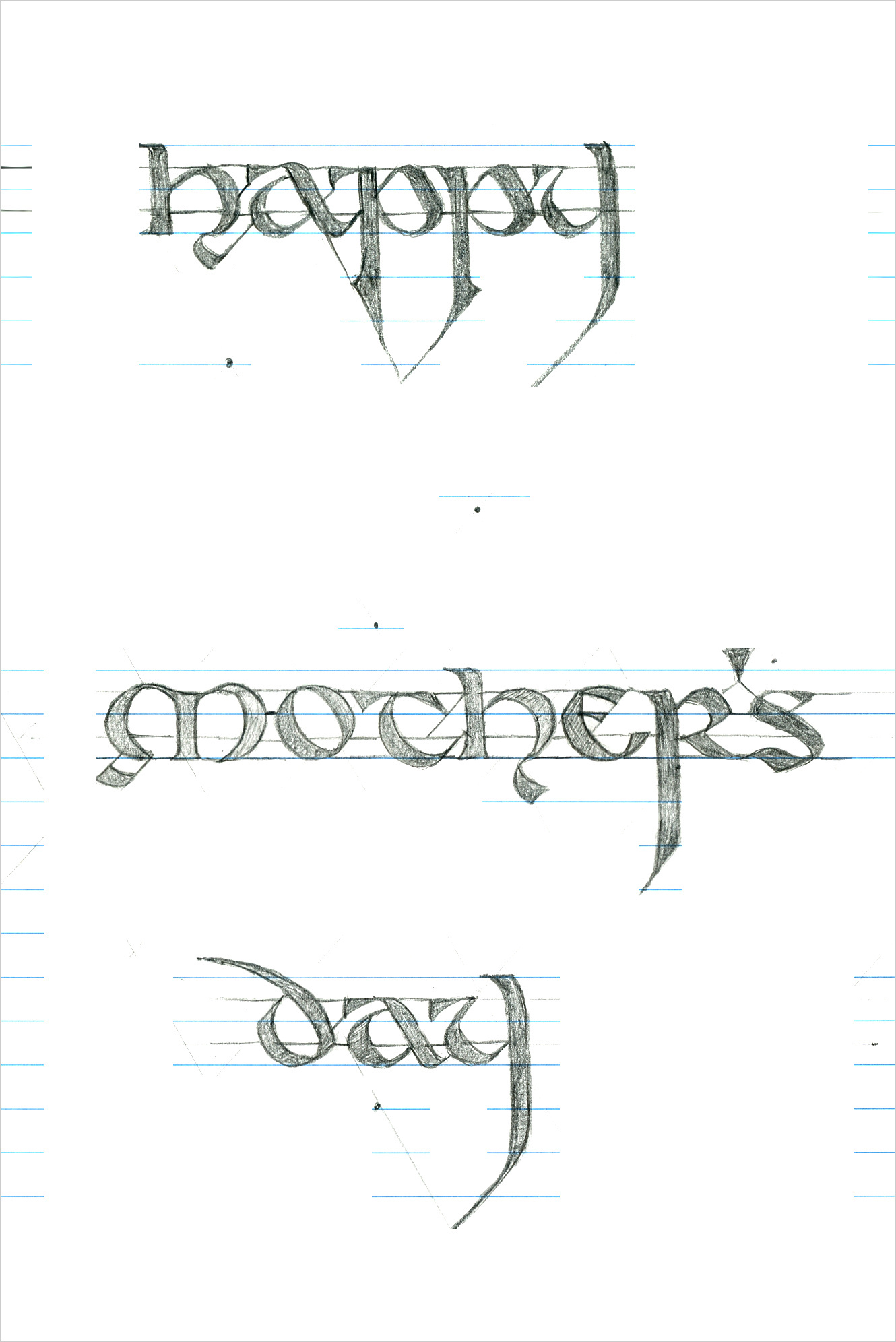
Here are various snapshots of the work in progress, to give you some idea of what goes into something like this.
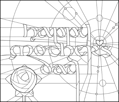

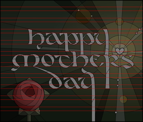
 HMD2019-grayscale.png