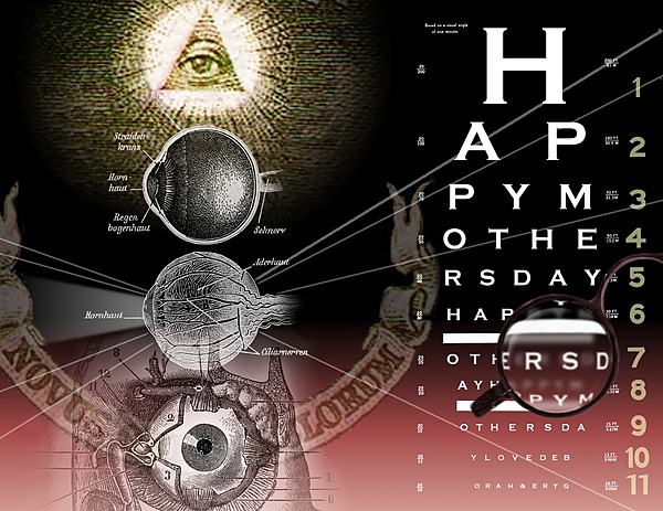
My Mom got cataract surgery this year, so I thought an "eye" theme would be nicely appropriate.
In my opinion, this was my first really good digital collage. It diverged a bit from the original design -- I prefer to be flexible and let the components I use dictate the direciton a piece will take.
For example, the banner was a complete accident: I had magnified a one dollar bill, made it semitransparent, and was positioning the eye in the pyramid when I noticed that the banner was almost perfectly situated to go through the center of the lowest eye. What I love most about it is that it's not thematically related, yet it somehow works perfectly. I need to remember that sometimes a random element is more intriguing.
P.S. I really like how the eye chart came out.


