


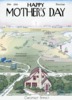


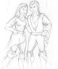

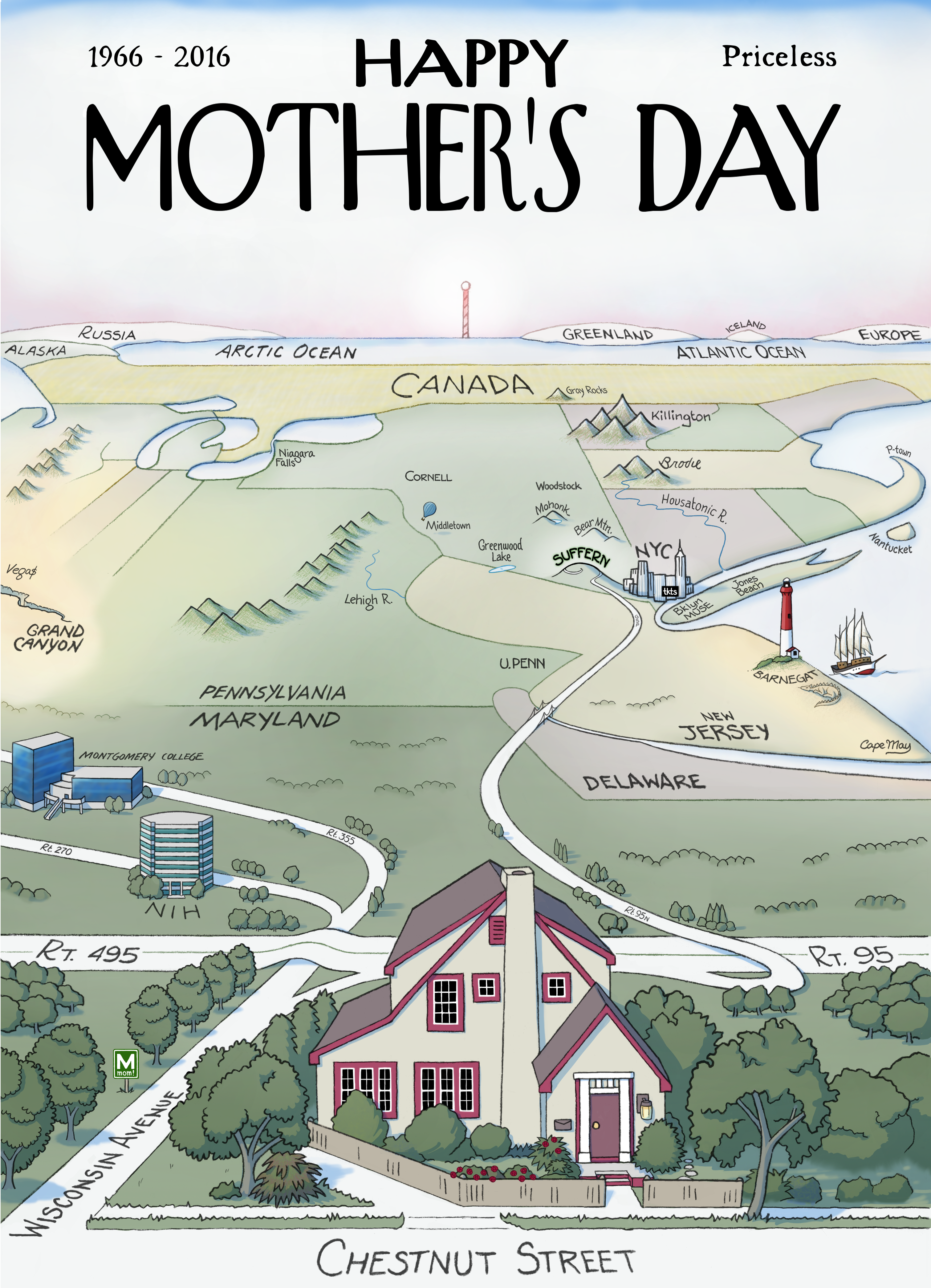
Inspiration
If we count pregnancy, this is my Mom's 50th "Mother's Day", so I wanted to do something more hand-crafted instead of my usual digital collage work. I was thinking about the many wonderful places my mom took me on vacation, and I thought I'd like to pay tribute to a few of them in the card this year.
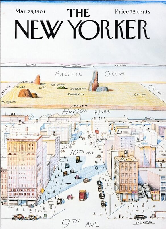
Growing up in and around New York City, I have always loved the classic "New Yorker" cover below (The View from 9th Avenue, by Saul Steinberg). So I thought I'd do something along these lines.
I tried a couple of variations in rough sketches and finally settled on the view from my house looking northward towards Suffern and my mother's house. That would allow me to work in most of the places I wanted, and to show the actual route we take when driving to see her.
I planned to do as much of the drawing as possible with actual paper and pencil, scanned and then given a bare minimum of cleanup. This would mimic the rough lines of the original. Since the concept was simple and final product did not need to be as crisp as my usual work, I estimated a day to do the linework and a couple of days to add color.
But there was a problem. Several problems, actually.
Differences
The geography of the New Yorker cover is intentionally vague and inaccurate above the Hudson River. It's meant to symbolize the idea that New York City residents don't give much thought to regions outside the confines of Manhattan Island. New Jersey has been reduced to a featureless brown strip (OK, maybe that's not completely inaccurate if you spend a lot of time on the Turnpike) and the rest of the United States is a mustard rectangle with a few scattered mountains and place names.
But if I followed this approach, I'd be placing undue emphasis on my own house (in the foreground) and handwaving-away the particulars of the places my mother took me — the very opposite of what I wanted to achieve. Plus, it felt lazy to just throw together a jumble of place names in the center of the card.
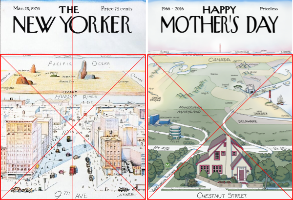
I decided that at the very least I should at put the significant places in proper spatial relationship to each other. So I started by sketching the state lines ... which turned out to be a lot more work than I'd anticipated, given the need for a dramtically-distorted perspective.
Once the state lines were in, I didn't really want to lose them. They helped orient the viewer, and I was proud that I'd been able to make them work... although I had to change some proportions to fit in the details I wanted. That's why the horizon line ended up being slightly higher in my version, even though I'd originally intended to keep it the same. That doesn't seem like a big sacrifice until you examine the layout of the original and discover that it confines the earth (from 9th Avenue to the horizon) to a perfect square:
But although the original has a pleasing geometrical frame, it plays fast-and-loose with perspective within that frame — something I was less comfortable with.
A casual examination of the original appears to show two main vanishing points: one around the center of the Hudson river (for the cityscape), and one high in the sky (for the countryside). I say "appears" because the reality is somewhat messier. There are, in fact, many vanishing points. For example, the street edges between 9th and 10th use a higher point than the street edges between 10th and 11th. It may be that Steinberg was attempting an informal curved perspective, or it may simply be that he was working roughly and not sweating the fine details. I wanted more precision, so I chose two principal vanishing points and tried to keep to them (despite some late fiddling with state boundaries):
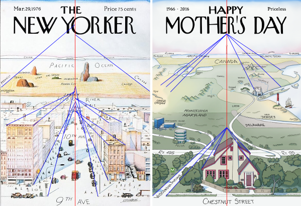
I should note that the border between Maryland and Delaware does slant rather than following a north-south line, although the slant here is more pronounced than it would really be.
A final difference emerged when the linework was done and it was time to color. The original uses pale shades of pink, orange, and blue, with quite a lot of white: possibly colored pencil or pastel on textured paper, with some light washes.
When I tried replicating this look I wasn't happy with it at all. I wanted the landscape to have more color, especially to highlight areas of beach or desert. The "colored pencil texture" tended to obscure the finer details I introduced, especially in elements that were meant to be more distant. In the end I went back to my usual technique of smooth color layers and only used the pencil texture on certain features, like the mountains, the sand sculpture, and some of the foliage. I even did a quick digital inking of the white window muntins, since they looked awful when they were not clean and precise.
Details
- House
- Yes, our house really does look like that, although we actually have homes around it. I tried to accurately depict some of our trees and shrubs, including the three arborvitae at the end of our driveway. The low, shaggy, reddish Japanese maple to the left of our driveway is called Cousin Itt. The rose bush growing up the side of the house is Cleopatra.
- Roads
-
In real life, the green "M" sign in the foreground
indicates the NIH metro stop. Here it stands for "mom!"
because this is the actual route we take when driving to
mom's house in Suffern — well, most of it at least.
Rt. 495/95 is the DC Beltway.
If you zoom in you can see Rt. 95 North,
which eventually becomes the New Jersey Turnpike
after you cross the Delaware Memorial Bridge (shown!).
Further up I've put "GSP" to represent the Garden State Parkway,
although the GSP exit is not shown,
nor is the fact that we briefly get onto the Thruway northbound
when we cross into New York.
But my mom does live on the side of a hill that rolls down into New Jersey.
I was quite pleased at how the line of Wisconsin Avenue leads the eye up to the line of 95 North in New Jersey.
- Maryland
- My NIH building (backing onto Rt. 270) and my lady's Montgomery College building (next to Rt. 355) are also shown, albeit highly simplified.
- Western U.S.
- Las Vegas and the Grand Canyon were parts of a memorable vacation with mom, whitewater rafting down the Colorado River through the canyon itself.
- Pennsylvania
- The Lehigh River is perhaps the first place mom and I went whitewater rafting. University of Pennsylvania is where I went to graduate school, and met my lady.
- New Jersey
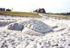
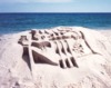
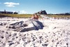
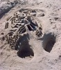
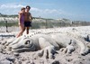
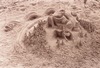
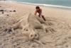
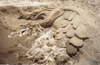
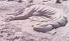
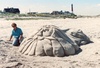
- Mom and I did a lot of sand-sculpting in Barnegat, pretty close to the lighthouse itself. The sculpture shown is this dragon. Off the coast is a four-masted sailing ship representing the Windjammer barefoot cruises that we took through the West Indies and Virgin Islands. At the southen tip of the state is Cape May, where we saw wondferful Victorian houses.
- New England and Canada
- Brodie, Killington, and Gray Rocks are just three of the places mom took me skiing while I was growing up. Gray Rocks was a special trip, but we returned to Brodie and Killington many times. The Housatonic was the site of yet another interesting river-rafting trip -- this one involving a lightning storm while we were on the water. We also went biking on Nantucket and Block Island, and made a trip out to Provincetown.
- New York
-
Mom took me to a lot of great shows in NYC, and one memory I have
is waiting in line for tkts to open at noon, followed by a lunch
at Sbarros before the 2pm matinee. We also so a great outdoor production of
"Fiddler on the Roof" at Jones Beach. I grew up in Brooklyn, and was very
fortunate that my mom took me to the Brooklyn Children's Museum at MUSE.
We did a lot of hiking and cycling in New York: a two-day ride to and from
Greenwood Lake in hundred-degree weather stands out, plus lots of rock scrambling
around the Mohonk Mountain House. We've also taken day trips to places like
Woodstock to see crafts or antiques.
Cornell was where I went for undergrad, and we visited the campus on the way to Niagara Falls. One reason I got into Cornell early decision was my essay and interview... where I talked about the many places my mom and I had travelled. :-)