Inspiration
My mother introduced me to the art of M. C. Escher when I was pretty young. I can't remember what came first -- our visit to a museum exhibit of his works, or my incessant flipping through a now dog-eared copy of The World of M. C. Escher. Either way, I was hooked. My mother also bought several jigsaw puzzles of Escher prints, including the interlocking birds of Day and Night and the impossible architecture of Convex and Concave. After we assembled these, she glued them onto backing boards, framed them, and hung them on the walls of our house, where they would continue to inspire me for years.
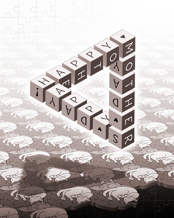
By exposing me to Escher's paradoxical objects and ingenious tesselations, my mother taught me that visual art could be simultaneously delightful and thought-provoking, like a magician's trick. Here, then, is Puzzle -- my 2017 Mother's Day Card.
Ingredients and Process
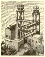
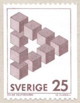
The central triangular motif is an impossible object called a Penrose triangle. Escher used two Penrose triangles as the framework for one of his most famous and beloved compositions, Waterfall. While my card draws its structure from Waterfall, I based the triangle itself on the impossible triangle-of-cubes created by Swedish painter Oscar Reutersvärd, and shown on the stamp below.
Although it would have been a simple matter to use a graphics program to create and letter the cubes, I decided against it -- it felt wrong, somehow, to completely depend upon a computer to draw the central motif in a work dedicated to Escher, who created marvels without such technology.
The layout of the lettering on the cubes was important. I knew I wanted the words HAPPY MOTHERS DAY to be readable by following the eye around the triangle, but I wanted it to be elegant. Ultimately I chose a layout where each third of the phrase ("HAPPY", "MOTHER", "S DAY!") was rooted at a corner that could be read either across or down.
So after carefully planning the placement of the letters, I printed out a sheet of isometric graph paper and drew the complete design with pencil and straight-edge. This, of course, I scanned in and digitally inked, but I think the slight irregularities introduced by act of drawing gave the final result a much more organic feel. I also did some subtle digital shading so that the colors of the cube faces would not be so perfectly consistent.
The impossible triangle casts a shadow which itself is impossible. First, going by the shadows on the faces of the cubes, the predominant illumination is from above and slightly to the left, so the shadow should be slightly to the right of the object, and (based on the orientation of the triangle) should be pointing in the opposite direction. But I like the idea that nothing in the scene can be trusted. A simple shadow, which at first glance reinforces the solidity of the object floating (impossibly) above it, only serves to subvert its own existence upon further scrutiny.
As for what the shadow is being cast upon...
The plane of sleeping cats was my homage to Escher's animal tesselations, in particular to the flying puzzle-pieces of Two Intersecting Planes. In keeping with the "triangle" theme, I decided to create a tesselation of three sleeping cats arrayed in a hexagon, their colors echoing the three colors of the cube. This, I reasoned, would be fairly strightforward.
I was sorely mistaken.
Producing a basic tile which could be repeated and which obeyed the basic rules of feline anatomy took more time than any other aspect of this project. Even towards the end I was fiddling with the results, and I still think the design could be improved. Here is the basic tile:
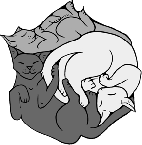
And here it is after being carefully lined up with six of its brethren and correcting the slight gaps and overlaps:
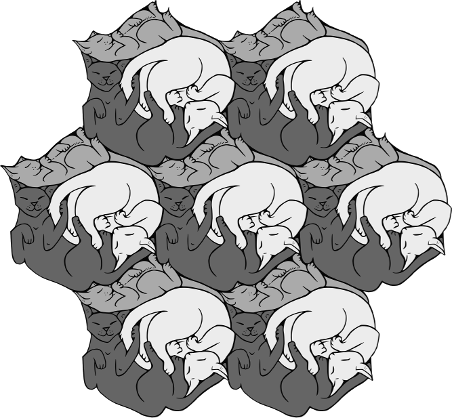
The idea was to repeat this pattern enough times that I could use a simple "perspective" transformation in GIMP (my raster graphics editor) to give the impression of a flat plane receding into the distance. The impression of distance itself would be achieved by adding a transparent layer above the plane that faded to white as it neared the horizon line. Escher used the same "fade to white" distance cue in Waterfall.
For my initial stab at the plane, I painstakingly lined up tile with tile, tab into slot, creating larger and larger fields which I could then duplicate and line up with the fields that preceded them. Only after doing this for the better part of an hour did I realize that the effort was completely unnecessary. A simple grouping of seven tiles (like the one above) provided enough repetition for extracting a simple rectangle which could be tesselated automatically (and far more reliably) by GIMP:
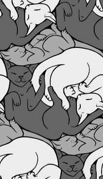
A minor detail: the edges of the plane of cats do not "fly off" or define elements through negative space in the same satisfying way as the creatures in Escher's Two Intersecting Planes. However, if you look closely at the foremost dark cat on the right, you'll notice that his tail is actually curled away from the head of the white cat. This is meant to suggest -- in a very subtle way -- that the cats can "escape" from their own plane of reality. I hope someday to return to this piece and make the effect more dramatic, possible by having the lower half of the dark cat curl downwards and become more realistic.
To give the piece a more Escher-like appearance, I added an overall sepia tint and a sandy texture suggestive of a lithograph.
And finally, as an homage to the Escher jigsaw puzzles my mom and I put together, I wanted the corners of the piece to show a jigsaw pattern, which I obtained from the Web and modified up so that it would look like a run of edge and corner pieces. In the top left corner, the jigsaw pattern is white and gently fades into the plane of cats, suggesting that the entire composition is "really" just a jigsaw puzzle. However, in the bottom right corner, the jigsaw pattern is black and is obscured by the plane of cats, suggesting that the cats occupy the same reality as the puzzle pieces. It was very gratifying to introduce this real-world element -- my mother's gift to me of both literal and figurative Escher puzzles -- as both a literal and figurative puzzle-within-a-puzzle in this composition.


