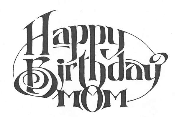
This one I did in a sort of retro 19th-century Coca-Cola-Ad-style. There was a sort of unexpected surprise: after I scanned in the artwork, I noticed that the converging tails of the "th" in "Birthday" -- which meet inside the "o" of "Mom" -- made an angle which perfectly reflected the "M"s on either side. That was not intentional. I considered amending the design post facto to enhance the similarity by joining the two tails, but decided against it. Sometimes you have to trust the aesthetics of a piece.


