


Inspiration
My mom did a lot of artwork with me when I was a kid -- she was even a sort of guest art teacher for my 2nd grade class. One of the first projects I remember doing were plaster handprints. The kids were each given a stiff board about the size of a sheet of paper, probably some kind of acoustical tile. Onto these my mom spread a thick dollop of plaster. The kids pressed their hands (one or both) into the plaster and kept them there until it set up. After the stuff hardened fully we would decorate our handprints with poster paints and give them to our parents.
So this year I thought I'd do a Mother's Day card commemorating that.
What I hadn't realized (but learned when I spoke to my mom on the day itself) is that the plaster handprints were Mother's Day gifts themselves. My mom even recited a little poem that went with them:
These are my hands dear mother
They're just for you today
I'll show you how much I love you,
by helping in every way.
So this year's card is an even more appropriate homage than I'd realized.
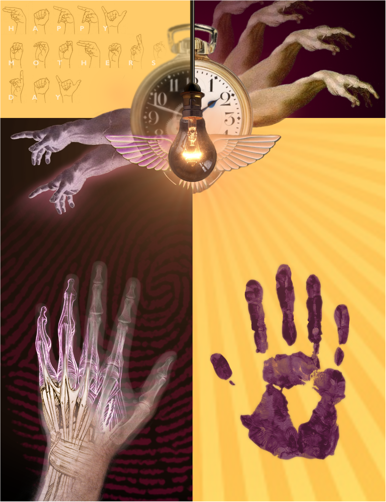
Creation
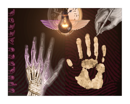
As usual, I used the GIMP for the digital editing, and my Wacom tablet. I chose one of my favorite color triangles: gold, orange, and purple.
I knew I wanted a pair of hands to be the main anchor of the design, and at least one of them needed to be a handprint. But I started with the other hand, for reasons you'll see.
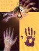
For the left hand, I chose an anatomical reveal similar to parts of Stork. The bottom layer is an actual x-ray I found on the web; above that is a superimposed anatomic drawing done as a glowing violet outline; then that same drawing as parchment; then a photograph of my own hand taken by Deborah -- all suitably tweaked to line up. As a final touch, the background is actually a highly-magnified fingerprint, meant to connect again with the original idea of handprints.
For the right hand, I took the x-ray of the left hand and flipped it over, creating a perfect mirror image to use as a guide. Then I found a suitable handprint on the web and (again) tweaked it so everything would line up. Here I left the background very simple, so as to not compete with the simple design. When I did the rough layout I knew I needed to direct the eye upward, so I chose the rays.
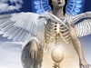
Above these I knew I wanted some central design element, and I hit upon the idea of the Angel of Creation. Everything to the left would represent the moments leading up to the creation of the artwork -- in this case the genesis of the hand itself, bones to muscles to skin. Everything to the right would represent the moments after creation -- the handprint or other creation left behind, the legacy of the artist.
I started with a clock (well, pocketwatch) divided in half. The left half was done inverse, desaturated, and slightly blurry, like the x-ray of the hand below it. I even added some ghostly gears to show the inner workings. The right half was left more-or-less alone. Notice that the clock also has two "hands", one on either side.
Wings for the angel (from the Bentley logo) were given the same treatment -- wings being avian "hands", of course.
The light bulb is our cultural symbol for inspiration and illumination. Plus it provided a rationale for a golden glow that would unify the design elements.
The arms were a sudden inspiration. Angels in real biblical lore are frightening creatures, with multiple heads and wings. In keeping with the central theme I opted for multiple arms, and what better arms to symbolize Creator and Creation than those of God and Adam from the Sistine Chapel? God's arms are in inverse on the left side, representing the artist, and Adam's arms are on the right side, representing the imprint of that artist on the physical world. The multiple arms are also supposed to represent time passing, like a sequence of stills of clock hands moving.
The words "Happy Mother's Day" in American Sign Language finished the design, in the upper-left field. I kept this very subtle so it would not distract from the rest of the design.
False start
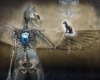
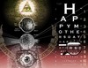
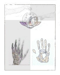
No, this stuff doesn't always come together right off the bat. The first incarnation of this piece was oriented landscape instead of portrait, and the crowding of the elements ultimately made it impossible for me to develop the themes. I stopped around the point it looked like this:
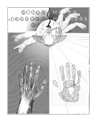
I extended the page upwards so that the long side was now the short side, but still keeping the 8:10 proportion for printing. I ran the image through a "trace edges" filter, broke the elements up into individual layers, and began moving them around and sketching with the tablet.
That evolved into this final rough, which survived more-or-less intact:
Final thoughts
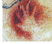
Like stick figures, handprints are an almost universally-recognized symbol of humanity. The handprint below is from a cave painting in Chauvet Cave, located in southern France. It is thirty-two thousand years old, and is reportedly the oldest portrait of an actual human being, made by blowing tinted charcoal dust through a straw. Thirty-two millenia later, we are still using hands and pigment to say "I was here" to future generations.