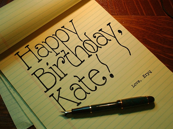
Pictures can be so deceiving.
The main text was done on a sheet of plain paper. It was then scanned, made transparent, and stretched to match the perspective of the yellow legal pad. Part of the "K" was erased to make it look like it's being obscured by the top of the pen. And the "Love, Eryq" was just done with the text and perspective tools.


