


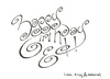
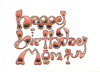
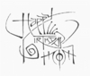
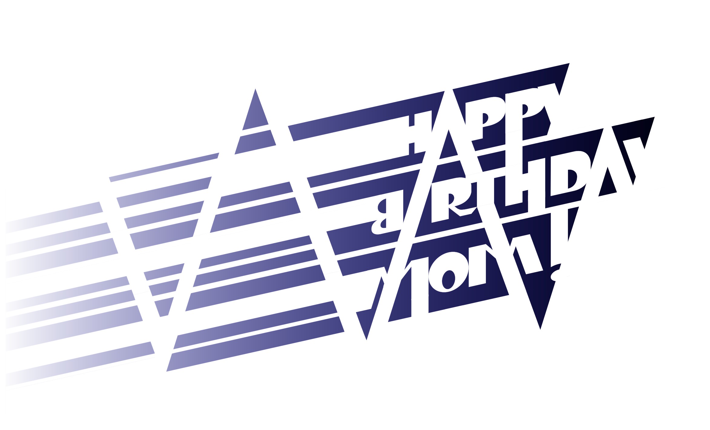
Often I'll work on a design for a solid week and hate it, but then everything will come together at two in the morning the night before the deadline. That happened here.
Part of it is focus, but part is trying progressively bolder experiments out of sheer desperation. In this case, it was letting the slants of the As and Ys define a zig-zag motif. The entire left side was invented tonight.
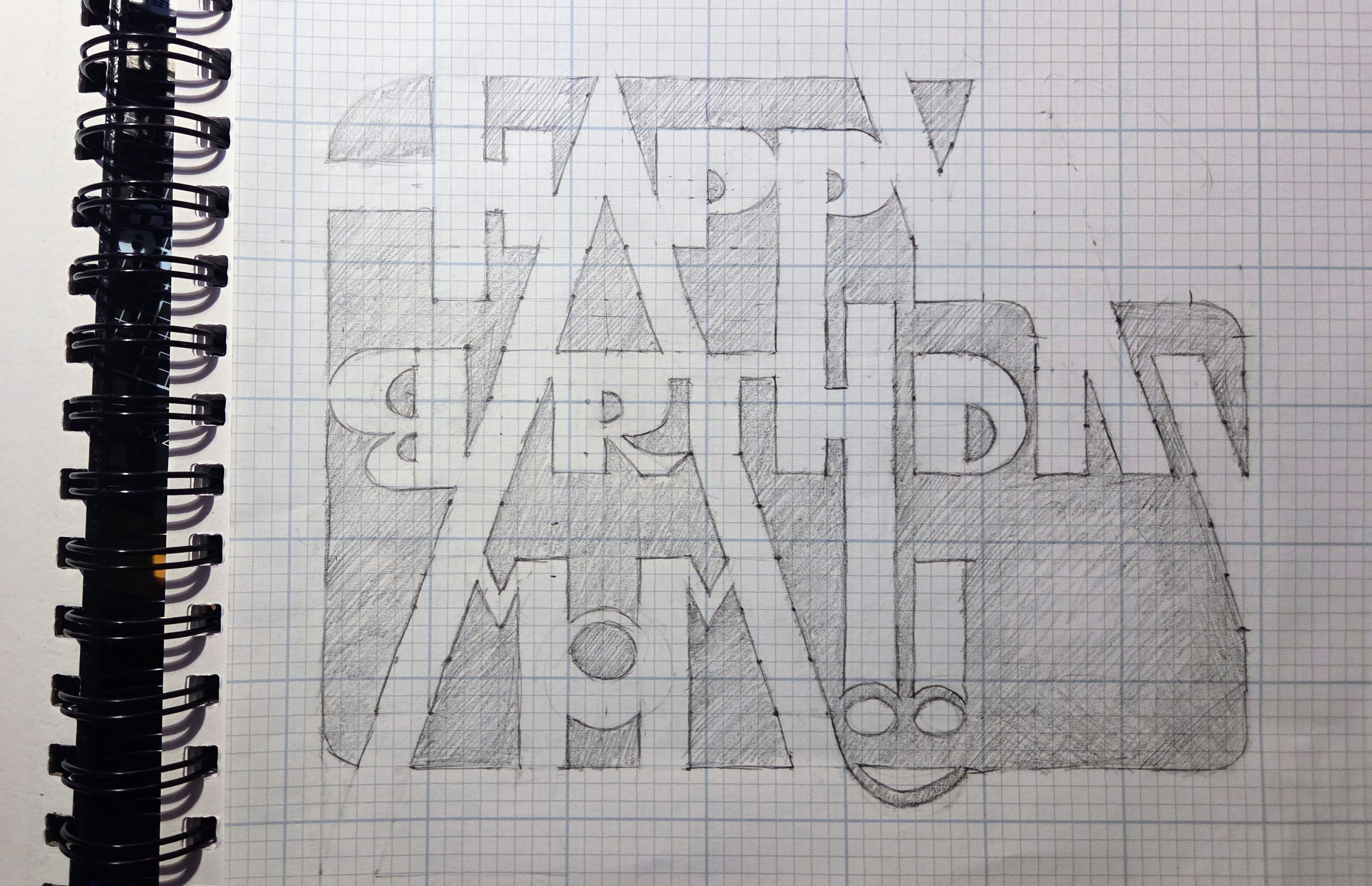
The core of this piece was designed on graph paper with everything "square" (e.g., the Hs were composed of all right angles). I thought I'd just finish by rotating it, but I accidentally grabbed the wrong handle and skewed it instead. I liked the effect so much I kept it.
I'm especially pleased with how this came out because I rescued my initial goal of having the "edge" letters defined by negative space.
Q & A
Why did I turn the B backwards?
Great question! When the B was in the correct orientation, the negative space between the B and I was distracting. I wanted the flat edge of the B to mirror the flat edge of the R, to create that nice symmetry around the I. That helped the I visually, as it's not a proper letter but part of the large A.
The B isn't just backwards, it's kind of upside-down. When I designed these letters I made them "top heavy" (see the Ps, D, and R). But Bs are usually "bottom heavy". So after repeated nudging and redrawing when things looked wrong, I ended up with what looks like an upside-down "regular" B. I could make the top hole smaller, but I liked how it balanced the larger holes of the D and the O.
Resolving these aesthetic conflicts is what makes these pieces take so damned long.
Original concept art
Yes, I generally start on paper. It's interesting to note what elements were preserved and what was changed. Note how the original AY of BIRTHDAY differed from those letters in HAPPY, and how reconciling them led naturally (if accidentally) to the zig-zag motif.